Friday, June 15, 2012

Lab 8


            The Station Fire in Los Angeles in 2009 had a huge impact on the city and its people.  Southern California is an area that has a great fire danger, and it is no surprise that the state was in drought when 
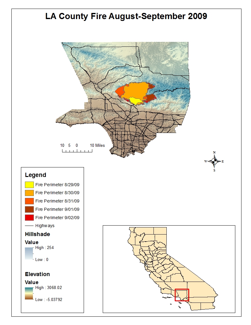
this fire occurred.  I created two maps that display the fire perimeters from the 2009 Station Fire in Los Angeles County.  The first map is a reference map to display the area in which the fire occurred as well as how the fire perimeters changed and grew on a daily basis.  The second map also shows the major cities, smaller cities, hospitals and highways that the fire affected.  My maps also include elevation data information, which helps to understand the affects of the fire.

            Southern California is an area at high risk for fires.  The geography in Los Angeles County contributes to this risk.  There have been many large fires that put the city and its residents in great danger.  One of the leading contributors to these large fires is drought.  Eight very large fires, about 150,000 acres in size, have occurred in California since the 19th century.  Each of these fires was preceded with an extremely long drought anywhere from one to four years long (“Large Fires Natural…”).  In a news update posted by the governor of California on November 30, 2009 it was stated, “The precipitation in Water Year 2009 was the third consecutive below average year for the state” (United States).  The Station Fire of 2009 was greatly affected by the condition that the state of California was in at the time.  Being a drought year that year immensely affected the fire in Los Angeles County. 

            This first map represents the area that the fire burned beginning on August 29, 2009 and ending on September 2, 2009.  Each different color shows how the perimeter of the fire grew each day.  This fire began on August 26, 2009 and the cause of the fire was arson.  In total the fire burned about 160,000 acres of land.  It was the largest fire in recorded history of Angeles National Forest (“Station Fire”).  It can be seen on the map that I created how quickly the fire was spreading.  Geography is a very important tool, an especially so in this situation because it provides useful information about the affects of the fire.  One application of using maps of this fire to acquire and analysis information is studying the potential sediment impact.  In a brief written about this fire and the study of the impact of sediment in the area stated, “The Station Fire burned area, which spread across numerous Debris Production Areas, is subdivided into 74 subarea watersheds” (Woods), the article then proceeds to direct the reader to an attached map.  This is one example of an application of the importance of geography and natural disaster. 

            The second map also shows the daily fire perimeters as well as the major cities, smaller cities, hospitals and highways that were affected.  In observing this map it can be seen how large of an impact this fire had on the city.  It burned through a major highway and was very close in proximity to many cities and hospitals.  An article written on August 31, 2009 stated, “More than 12,500 homes were threatened, and 6,600 were under mandatory evacuation orders Sunday night.” (“L.A. County Fire Doubles in Size”).  This statistic alone represents the impact of this fire, which is supported by this map. 

            The Station Fire of 2009 was a very large fire that impacted many cities and therefore people.  It burned a huge area of land.  The tool of GIS is so helpful in situations such as natural disaster because they can be used to outline the affected areas and studied to see the impacts that the fire will have on surrounding areas.  It is important information to know what cities, roads and hospitals will be affected, which is why I thought that would be important to display these landmarks on my map. 

Works Cited
"L.A. County Fire Doubles in Size; More Homes Destroyed; Mt. Wilson Threatened [Updated]." Los Angeles Times. Tribune, 31 Aug. 2009. Web. 8 June 2012. .
"Large Fires Natural and Inevitable in Southern California." The California Chaparral Institute. N.p., 4 Sept. 2009. Web. 8 June 2012. .
"Station Fire." InciWeb. N.p., 10 Nov. 2009. Web. 8 June 2012. .
United States. The Natural Resources Agency. Department of Water Resources. CA.gov Department of Water Resources. By Arnold Schwarzenegger, Mike Chrisman, and Lester A. Snow. N.p., 30 Nov. 2009. Web. 8 June 2012. .
Woods, Patricia. "Station Fire Burned Area Brief." Letter to Christopher Stone. 14 Jan. 2012. Los Angeles County Department of Public Works. N.p., n.d. Web. 8 June 2012. .

Thursday, May 31, 2012

Lab 7
This map represents the percent of black population by county of the continental United States.  The data used is from the U.S. Census from the year 2000.  This map shows where the highest concentration of black populations are, largely in the southern portion of the United States, near the perimeter of the country (rather than inland).  States such as Louisiana, Georgia, Florida, Alabama, Mississippi and South Carolina appear to have some of the highest percent of black populations in the U.S.  There also are a few counties in California that are shaded a dark color purple meaning that there is a large percent population of blacks in those areas as well.  
This map shows the percent of Asian population by county in the 48 states of the continental United States.  It was also created using the 2000 U.S. Census data.  This map shows that the Asian populations are highest on the west coast, especially in California.  As you move east across the map it appears that the Asian populations decrease.  However there are some areas on the east coast that appear to also have high percent populations of Asians, these include Florida and along the northeastern part of the U.S.


My final map is of the percent populations of other races by county, based on the 2000 U.S. Census data.  This map represents the other races that are not categorized separately, the races not grouped into their own larger category.  It shows that these 'other races' have much higher populations on the western half of the country.  These 'other races' do tend to have higher percent populations in Florida and along a few other states on the east coast but for the most part are centralized on the west coast.  

Overall my census map series is very informational and is a great way to display race population data because it provides a visual that makes it clear where some races' percent density are higher by showing them in a darker shade and then gradually fading to white, showing where a specific race is not so highly populated.  Displaying the U.S. Census data in this way is very effective because it visually displays the information making it easy to analyze and understand.  

Coming into this class I was unsure of what the capabilities of ArcGIS were.  Now having taken this class I realize the importance of GIS and mapmaking to the world and everyday life.  Maps are a great way to display information, and ArcGIS is the tool necessary to create these maps.  Maps and geography are such an important part of the world, and location information is crucial.  ArcGIS is a complicated program that one must have knowledge about to use.  Although sometimes very challenging and time consuming I found that as long as I was patient ArcGIS was not too difficult to use.  It was very specific and required some tedious work.  ArcGIS is a very powerful tool that allows for a wide variety of mapmaking.   

Wednesday, May 23, 2012

Lab 6


The area that I chose for this lab is the Lake Tahoe basin, including the surrounding Sierra Nevada Mountains.  I chose this area because it is where I am from, and I thought that the surrounding mountains would create interesting maps for this lab due to the varying elevations.  I retrieved my DEM data for this area from the USGS website.  I then created four maps of this area: a shaded relief map, a slope map, an aspect map and a 3D image.  The shaded relief map shows the features on the surface of the area in which I chose.  On my map the middle is a lake and therefore looks smooth, whereas surrounding the lake looks rough because of the mountain range.  The shaded relief map even shows the small crevices that lead towards the lake.  Shaded relief maps use the technique of hill shading to represent different features on the Earth’s surface.  The slope map shows the topography for the area.  A slope map is influential in land development.  My slope map shows the lake and other low, flat surfaces green and the mountains are colored red.  The red and green coloring represents the terrain’s degree of slope.  The aspect map uses colors to show the direction of the terrain.  The 3D image represents the area in a three-dimensional way; the mountains surrounding the lake protrude up around the lake.  The extent information for this area is: top 39.32245, left -120.5758, right -119.5044 and bottom 38.7194.  The spatial reference coordinate system for this area is GCS North American 1983.  

Thursday, May 17, 2012

Lab 5


 In this lab I created six individual maps that each displays a different type of map projection.  The first map projection is equal area and for this I chose Eckert IV and Bonne projections.  The next type of map projection is equidistant, for which I chose Berghaus Star and Azimuthal Equidistant projections.  The final type of map projection is conformal.  For my conformal map projection choices I chose Mercator and Stereographic.  Creating these different map projections in ArcMAP was not too difficult.  It involved creating new data frames and then choosing the map projection style to use.  I then measured the distance between two cities that I labeled on the map, Washington D.C. and Kabul, Afghanistan.  I found the measure tool a bit complicated because I was unsure of how to use the different measurement types.  I chose to just measure my maps using the planar measurement type.  Overall, even though this lab took me some time to complete it was not too tedious; it just required closely following a few steps. 

I found it very interesting how greatly the distance between Washington D.C. and Kabul, Afghanistan changed based on the type of map projection used.  The two map projections that had the greatest difference in distant were the Mercator and Bonne projections, with the Mercator projection having the distance between the two cities as 10,112.12 miles and the Bonne projection measuring the distance as 6.730.70 miles.  The different map projections of the same style seemed to have slightly different distances, but not as great as the differences between different types of map projections.

Map projection takes the physical three-dimensional world and translates it to a two-dimensional representation.  Map projection is very important because it allows for the world to be translated to a usable form.  People can study maps to learn about the Earth, and map projections allow a practical way of doing so.  Map projections even allow maps to be scaled to sizes that are portable and can fit in a car, carried with someone on a hike or displayed on a computer.  Certain map projections represent the Earth better than others.  The type of map projections can be chose by the creator based upon what they are trying to represent.  Some appear more consistent with how the Earth truly is, while some make it appear very different.  Of the map projections I chose the ones that are commonly used are Azimuthal Equidistant, Mercator and Stereographic.  Some of the other map projections that I used are uncommon and even appear very different. For example, the Berghaus Star was unlike any type of projection I have seen before. 

Map projections do have some downfalls.  The Earth is a round, and this must be translated to a flat piece of paper so it is obvious that there are going to be distortions.  For example, the Mercator projection makes Greenland appear as though it is huge and make Africa appear very small.  This projection distorts the size of countries and can be misleading.  In actuality Africa is not that small, and Greenland is not that large.  Another example of distortions can be seen on the Bonne projection.  On the Bonne projection it appears as though Africa is huge and makes Greenland look very small.  Maps can be very deceiving based on the way in which they are projected.  Another downfall of map projections is that different style projections will not be consistent.  This is shown through the different representations of map projections that I created in this lab because the distance between the two cities varied greatly.   

Wednesday, May 9, 2012

Lab 4

In this lab I used ArcMap to create maps of a proposed airport expansion project.  I created three maps, one that showed schools near the airport, one that showed land use surrounding the airport and one that showed population density for the county.  Overall, I found my experience with GIS to be a positive one.  The lab was very tedious and took a lot of time, but I found that by following the tutorial closely it was not too difficult.  The tutorial itself was very thorough and helpful.  Initially I read through it and it seemed a bit confusing, but going through it again while simultaneously completing the steps on ArcMap made it much more clear.  ArcMap was very helpful in this situation because it showed areas affected by the proposed airport expansion so that an informed decision could be made so that the airport would not negatively affect the community.

Humans are spatial organisms, and therefore location information is a large part of our world.  Location information is displayed through maps.  GIS is an important tool that allows for the compiling of data and effectively models the data.  There are many advantages to GIS.  GIS allows conduction of spatial analysis.  It also allows for ready access to data and for information to be updated as necessary.  The ArcMap program has many features that are useful when mapmaking.  One feature that was very helpful was the ability of ArcMap to calculate information by simply inputting a formula.  Also the program had many tools that simplified the process.  For example, by changing the name of a layer in the table of contents it automatically updates the name on the map legend.  Overall the program was user friendly, just a bit tedious.  GIS has much potential and is an important system. 

While ArcMap is a great tool for creating maps and displaying data sets, it does have its downfalls.  The first downfall is simply that it is a challenging program to use.  It has so many different features that it is sometimes confusing.  One must have previous knowledge about computers in order to use this program.  As for GIS in general there are also some pitfalls.  One of these is the way in which GIS creates categories.  For example, an area is categorized as agricultural, residential or commercial even if the whole area isn’t necessarily that certain category just the majority, which can be misleading.  Another downfall to GIS is that the program is quite expensive, making it less accessible. 

An additional factor of GIS is that someone must have knowledge about geography to use it.  This is both an advantage and a downfall.  It is a good thing because it limits people who do not know anything about geography from creating maps that contain misinformation.  However, this is a pitfall because it does not allow everyone to be able to use the program.  Someone must have extensive knowledge about geography to adequately use ArcMap.  I feel that in this lab having a background working with computers and taking drafting classes greatly helped me.  I was prepared for the tedious work and was able to get through it by just taking my time.  Overall GIS is a great system that allows for analysis of geographic information and aids in solving problems. 


Thursday, April 26, 2012

Lab 3

Top 10 Places to Skydive in the United States 

This map displays the top ten places to go skydiving in the United States according to the website americasbestonline.com.  I created this map using Google Maps.  It also includes a picture or video for each skydive location and the contact information for the business.  The pictures and videos I embedded into my map from various websites.  This map represents one opinion of the top skydiving locations in the United States.  

Neogeography is a recent process that allows people to create maps.  People can share location information using the Internet and make it available for friends and family to see, or even as a public map available to anyone online.  Mapping toolkits such as Google Maps makes it possible for people to do this.    

An advantage to neogeography is that it allows people to view maps that others have created to gain information, for example, viewing a map of a place one is vacationing allows the map to be used like a review of some one else's vacation.  This provides information about things they maybe should or shouldn't do, based on the experience of others.  This can be very helpful in planning a vacation.  Another example of an advantage to neogeography is that someone could view the map I created and choose a skydiving location based on relative location to them, its ranking and the pictures/videos. 

However, there are some pitfalls to neogeography.  Although the process is advantageous in that it allows people to share their maps and location experiences, at the same time this is reason for some concern.  Anyone could create a map, and even use invalid information.  Therefore not all neogeography maps can be reliable.  Unlike GIS, in neogeography one does not have to be a professional or have background in map making to create a map.  This raises questions about legitimacy of the maps created, similar to legitimacy concerns of websites such as Wikipedia where anyone can post information.  People could view maps created via neogeography and receive misinformation or a biased opinion.   

Links to websites where I found pictures and videos:
http://www.skydivelostprairie.com/Arnone-On-Strut.jpg
http://media.tcpalm.com/media/img/photos/2008/10/14/RSPORTS_IRC_Harry_Park-3555_t607.JPG
http://media-cdn.tripadvisor.com/media/photo-s/01/21/fd/e0/view-under-canopy.jpg
http://www.sandiegoskydiving.com/images/gallery/skydive-san-diego-parachute.jpg
http://www.funfix.com/Gallery/Images/lg_Skydive-Space-Center-01172012.jpg
http://farm3.staticflickr.com/2484/3649088668_dda6e53c57_z.jpg
http://www.youtube.com/watch?feature=player_embedded&v=KyEIB5ZHV0Y
http://www.southernutahadventures.com/photos/skydive2.jpg
http://s3-media1.ak.yelpcdn.com/bphoto/iR-hVzsw_AfMtrgRvHjcrw/l.jpg
http://www.portofshelton.com/sanderson/images/jumpcenter.jpg

Thursday, April 19, 2012

LAB 2 

1.     Name of Quadrangle: Beverly Hills Quadrangle
2.     Names of Adjacent Quadrangles:
·       Canoga Park
·       Van Nuys
·       Burbank
·       Topanga
·       Hollywood
·       Venice
·       Inglewood
3.     Date Quadrangle Was First Created: 1966
4.     Datum Used:
·       North American Datum of 1927 (NAD 27)
·       North American Datum of 1983 (NAD 83)
5.     Map Scale: 1:24,000
6.     At Scale 1:24,000:
a.     5 centimeters on the map is equivalent to 1,200 meters on the ground
b.     5 inches on the map is equivalent to 1.89 miles on the ground
c.     One mile on the ground is equivalent to 2.64 inches on the map
d.     3 kilometers on the ground is equivalent to 12.5 centimeters on the map
7.     Contour Interval: 20 feet
8.     Approximate Geographic Coordinates:
a.     The Public Affairs Building: 34°04’30”, -118°26’15” or 34.075°, -118.438°
b.     The tip of Santa Monica Pier: 34°00’27”, -118°30’00” or 34.008°, -118.500°
c.     The Upper Franklin Canyon Reservoir: 34°07’15”, -118°24’30” or 34.121°,
-118.408°
9.     Approximate Elevation:
a.     Greystone Mansion: 580 feet or 176.784 meters
b.     Woodlawn Cemetery: 140 feet or 42.672 meters   
c.     Crestwood Hills Park: 640 feet or 195.072 meters
10.  UTM Zone: Zone 11
11.  UTM Coordinates (lower left corner): 361500mE and 3763000mN
12.  Square meters per square of the UTM gridlines: 1,000,000 square meters
13.  Elevations at UTM northing 3771000m: 
14.  Magnetic Declination: 14° east
15.  Direction water flows (stream between 405 and Stone Canyon Reservoir): north to south
16.  Map of UCLA: